
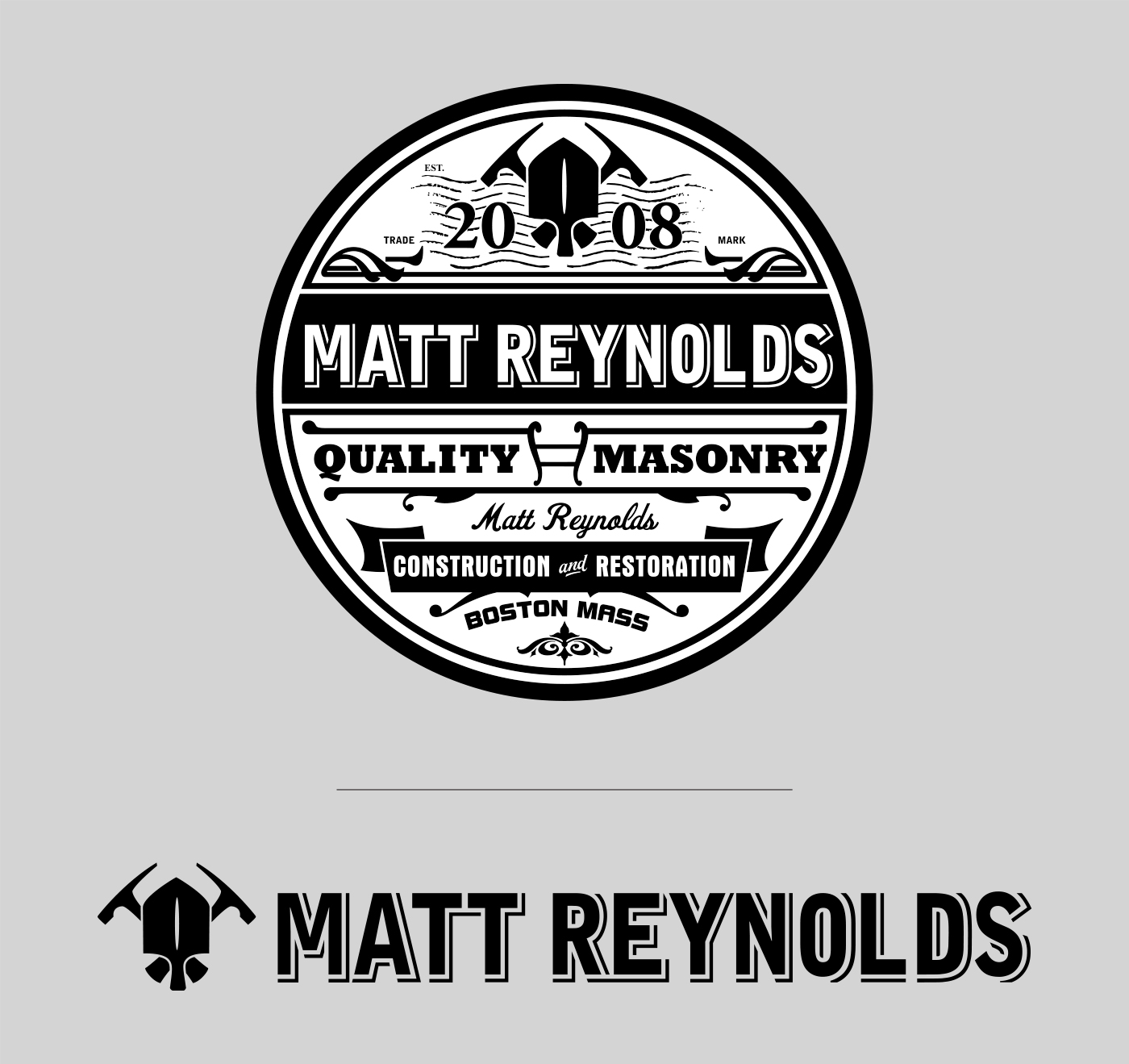
Matt Reynolds
// logo design
Matt needed a logo that represents the quality and attention to detail that he known for providing his clients. So after surveying the contractor market in Boston, I found the majority of the logo designs to be bland, cliche and nondescript. The masonry and concrete sector, specifically is not a very stylized sector when choosing a typeface or logo design.
The new logo I created reflects a traditional design style, which speaks to the long standing excellence and precise detail in all of Matt’s work. In addition, the new visual mark holds up as his seal of quality, as well as looking great on tee shirts.
Tony Capozzi – design
Shogun G. Curtis – creative direction
Logo
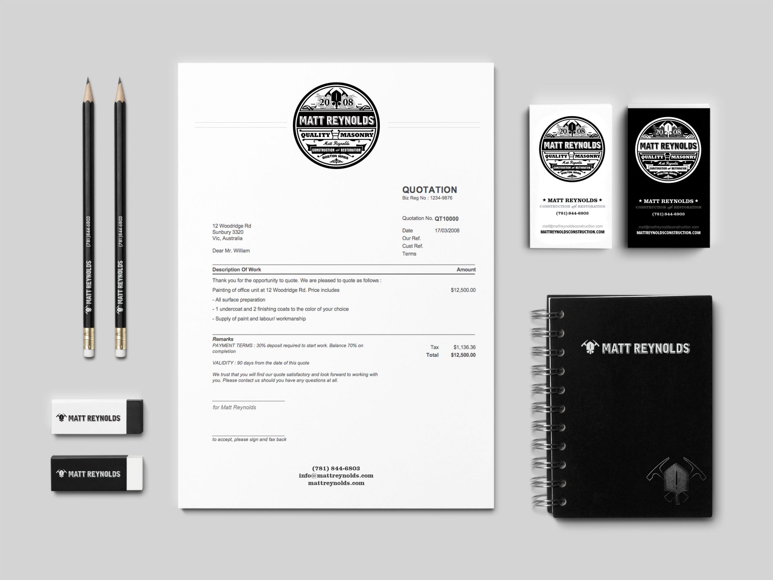
Brand suite

Employee tee shirt
Logo (alternate version)