
JohnHancock.com
// site design & UX
Most people aren’t aware of their full suite of offering: John Hancock also provides top-notch retirement solutions and individual investment strategies. Not to mention they’re the co-headlining sponsor of the Boston Marathon, have won countless awards for being one of the best places to work, and are at the forefront of innovative corporate culture.
We designed a robust site capable of explaining different types of life insurances, housing marketing campaigns, shining light on the company’s various sponsorships, and highlighted why John Hancock is winning all those awards.
Tony Capozzi – art direction, design, UX
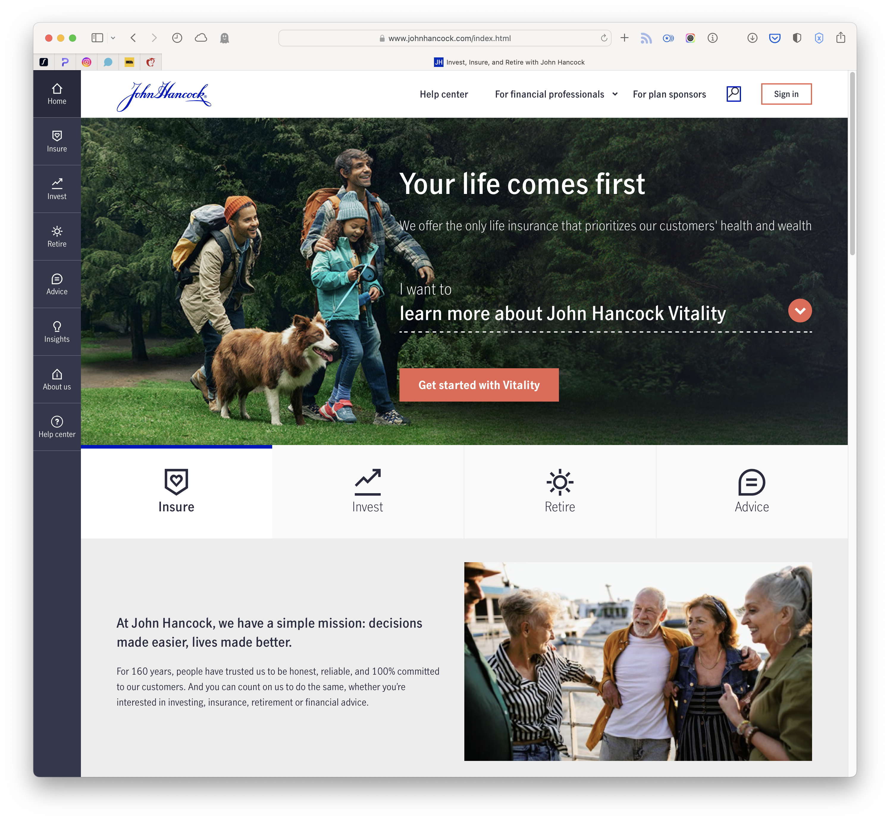
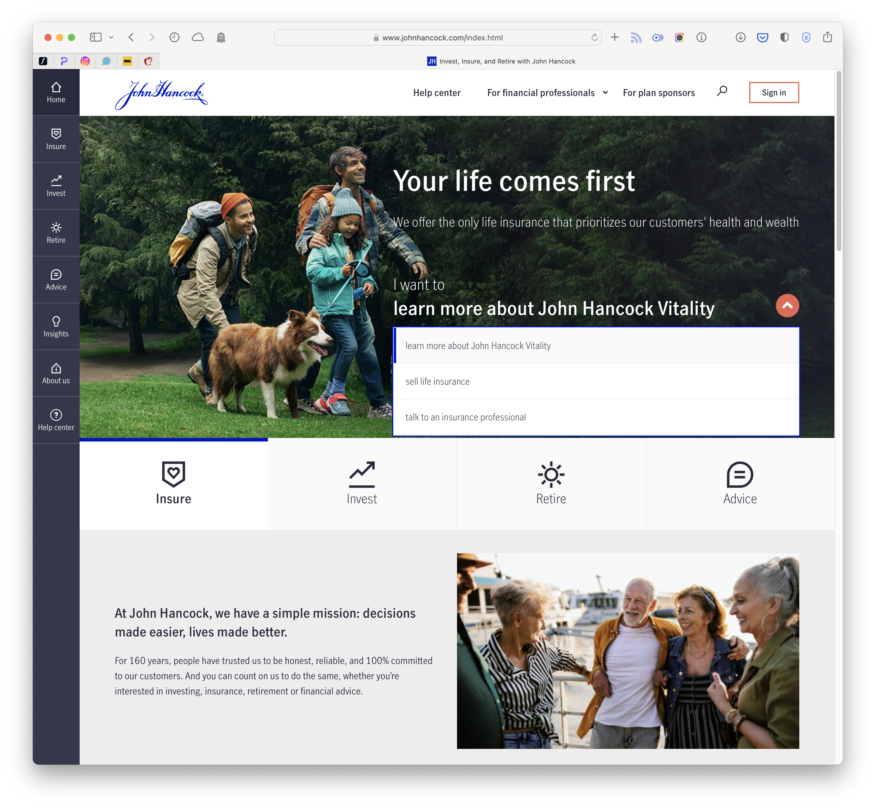
Users First
We kept the users wants and needs at the top of our mind when designing the site. And it started on the homepage, where we incorporated the “I want to” dropdown, which allowed users to answer a simple question upon arriving on our site. What do you want to do? We populated the responses with the most popular information our users were looking for and saw a big uptick in overall site engagement and a decrease in bounce rate.
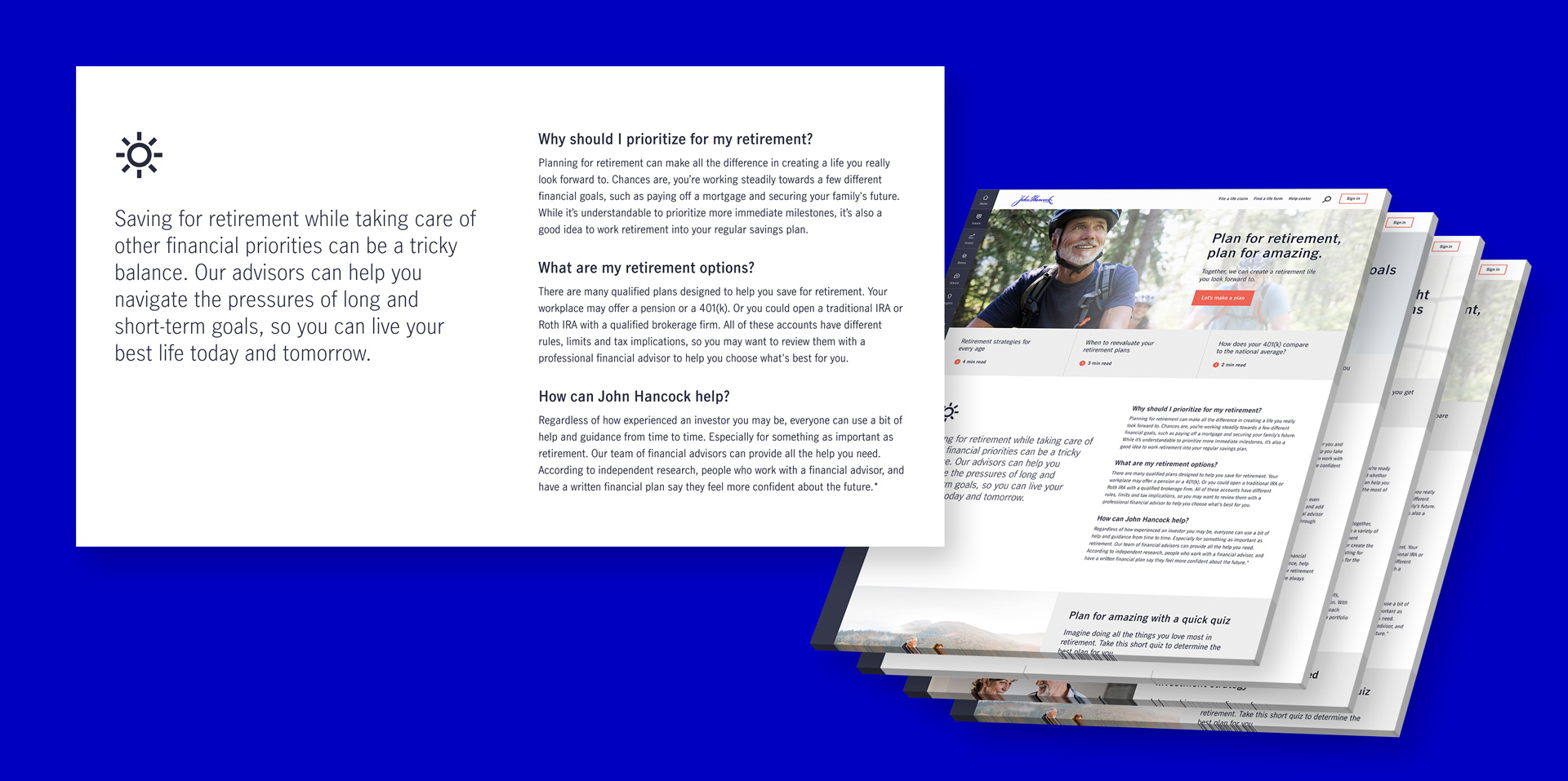
Approachable Experts
We know talking finance is intimidating and tricky to navigate, so we made sure we were the approachable experts by adjusting our tone of voice and content. We educated users by answering questions we knew they had like “what are my retirement options?” or “How can John Hancock help?” This was a staple throughout the site, especially on the lanes of business landing pages.
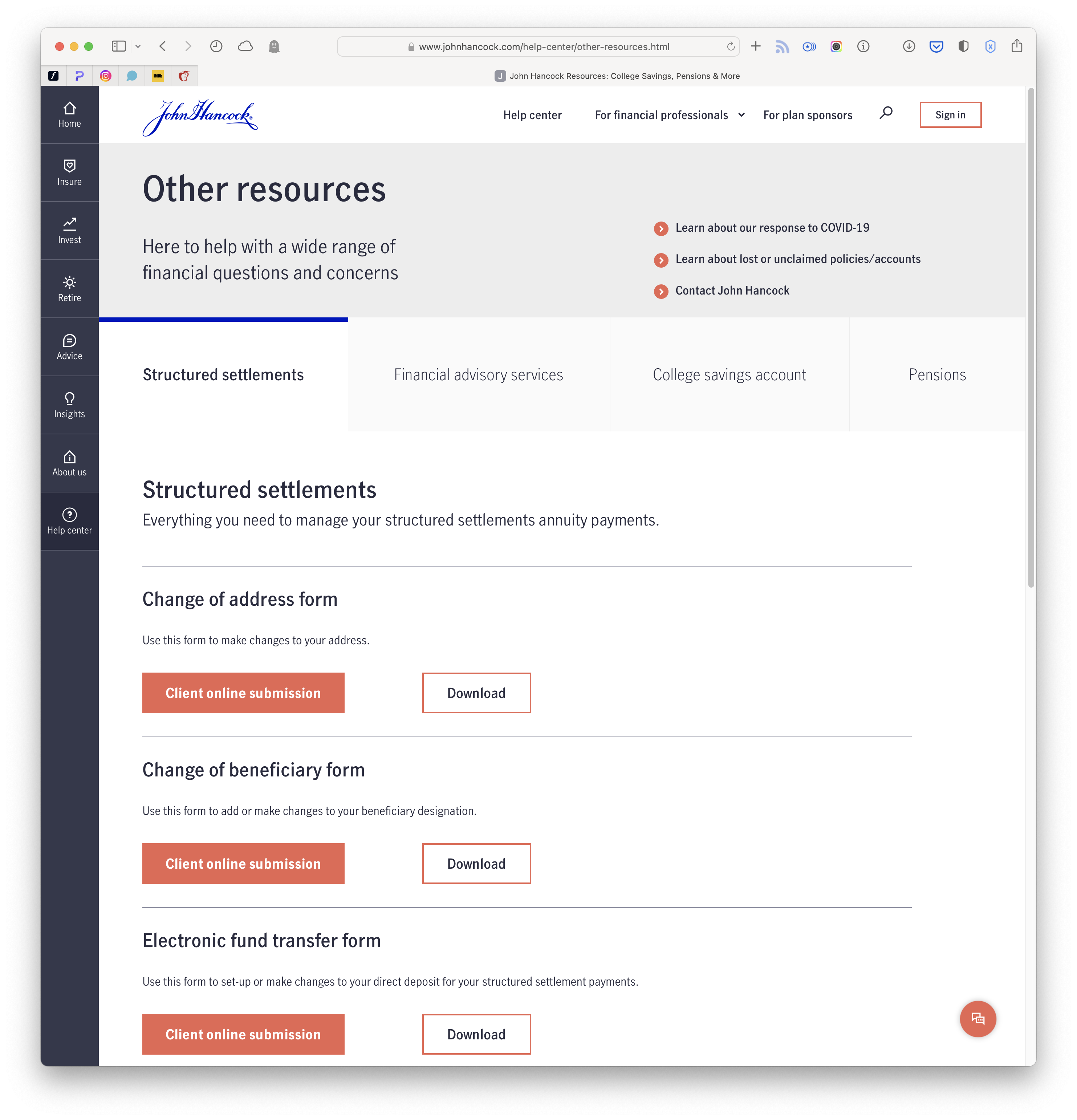
Need help with your policy?
No problem. We built out a robust help center that answered pretty much every question users had. So much so, we saw a dramatic reduction in calls to our help line.

A little bit about us
Interestingly enough, the About Us section was one of the most robust parts of the site. It needed to include everything from leadership bios to sponsorship information to media guides.
