


Boston Public Library
// branding
I was given the chance to help the Boston Public Library with some internal communications in 2016 through some pro bono work. This lead to building a long relationship and the opportunity to update the library branding and several murals in affiliated branches.
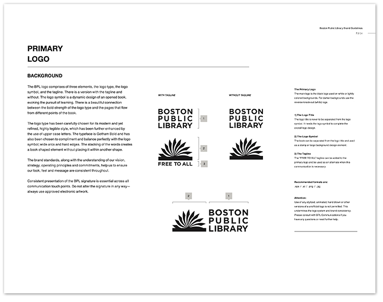
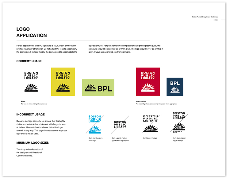
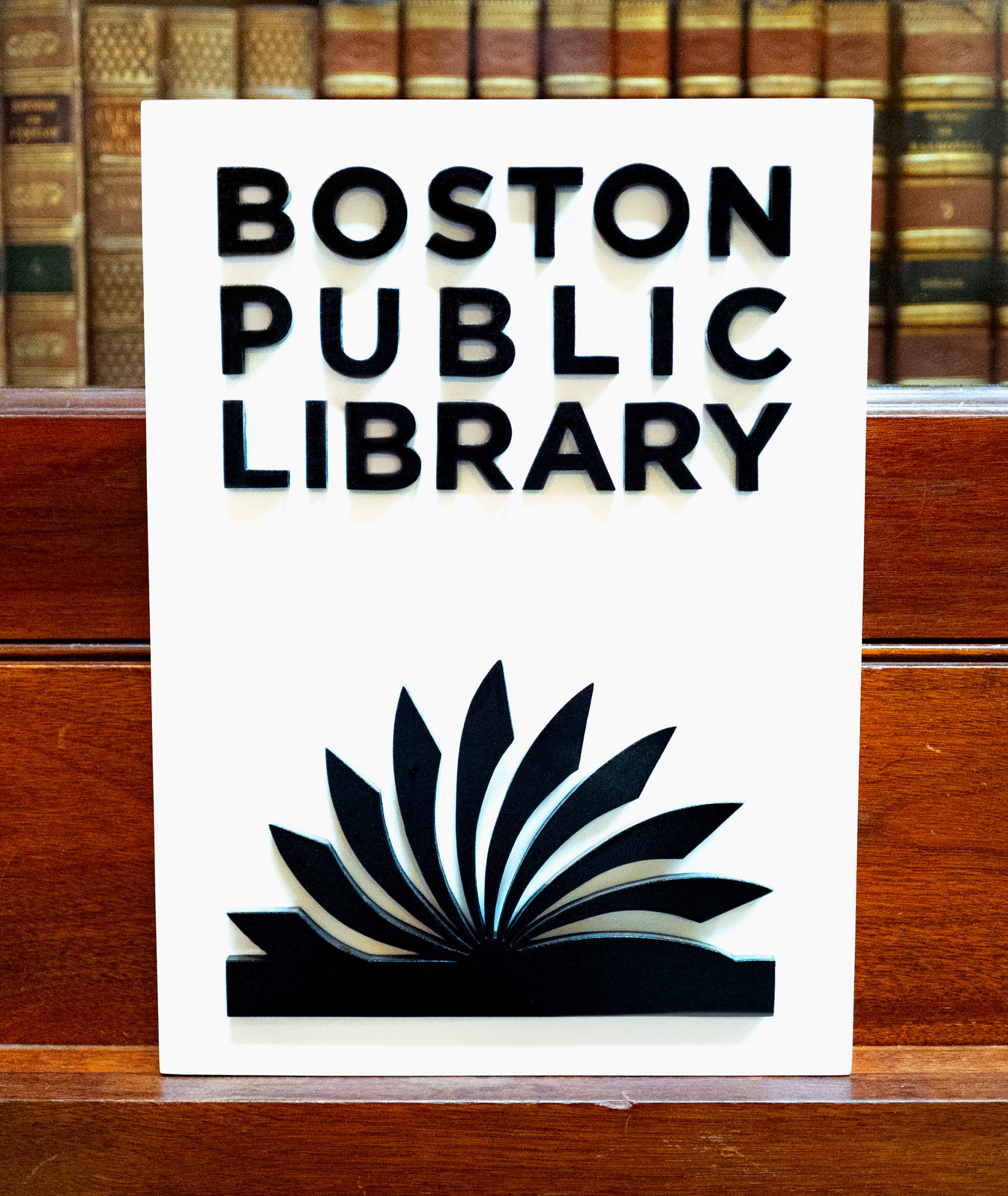
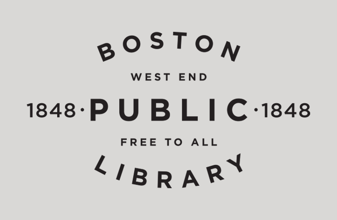
The basis of a traditional library are books; comprised of black ink upon it’s white pages. Hence, the black logo should be used as much as possible. The box shape was retained without recreating it. The new logo is open above the pages to represent the openness which is essential to learning, the openness of the new physical renovated Central Library space, and lastly the openness of the Boston Public Libraries to the public; based on their tagline, “FREE TO ALL.”
Tony Capozzi – design

Primary logo

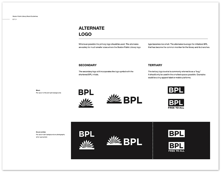
Secondary and tertiary logos

Primary color palette
Brand guidelines
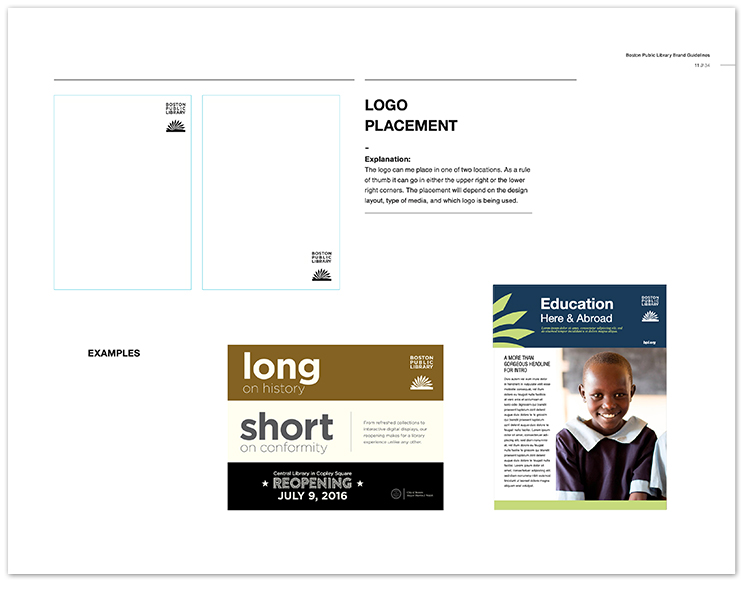
Brand guidelines
Brand guidelines
Brand guidelines
Brand guidelines
Brand guidelines
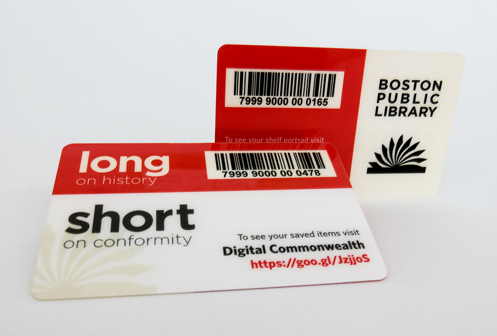
Digital library card

Tote
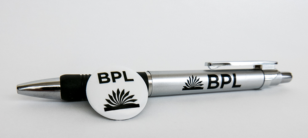
Pen & pin
Individual branch seals
